2023
Arlux OptiqueVisual identity for an optician established in 1967
Arlux Optique has been fitting glasses in Algeria since 1967. The brief asked for one mark, simple enough to remember, that carried that history without looking old.
I worked on it inside the agency Creative Touche, from the first sketches through to the applications.
Team
Brand designer (me)
Creative Touche agency
Client team
Brand identity
2023
The brief
Heritage, in a mark you can remember
The client asked for three things: a simple logo, easy to remember, built as a pictogram beside a logotype. Everything else — the reference, the geometry, the palette — was ours to find.
We started wide, from minimal marks to elaborate ones, each reading a different part of the brand's history.
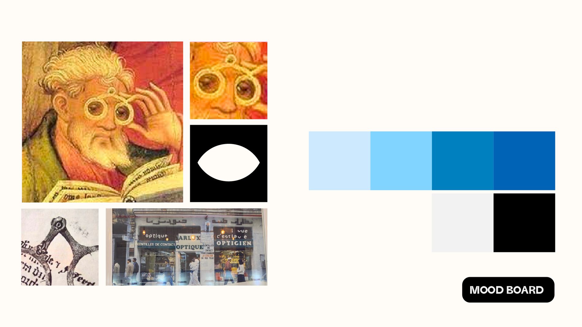
The mood board that set the direction.
The idea
The first pair of glasses, turned into an eye
One sketch stood out: the frame Salvino d'Armate is credited with, around 1285. Reduced to its two rims and bridge, it reads as an eye — heritage and precision in the same shape.
That became the mark. The logotype stays quiet beside it, so the pictogram can travel on its own.

The mark and the logotype.
Construction
Drawn on the golden ratio
The mark is built on the golden ratio, which keeps the curves consistent at any size and gives the shop something to point at when they explain it.
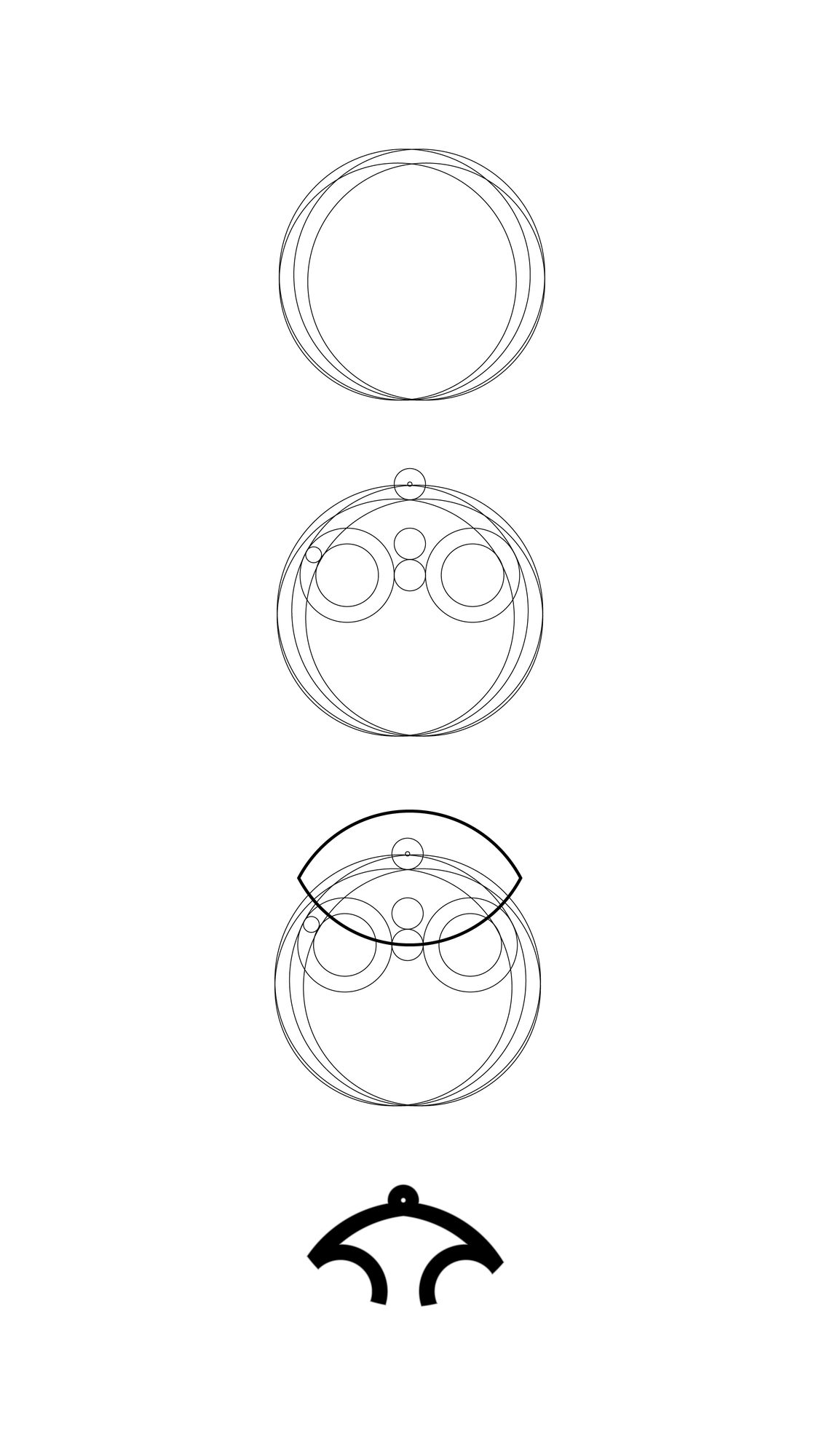
Circles first, then the frame, then the eye.
Applications
Tested where it would actually be seen
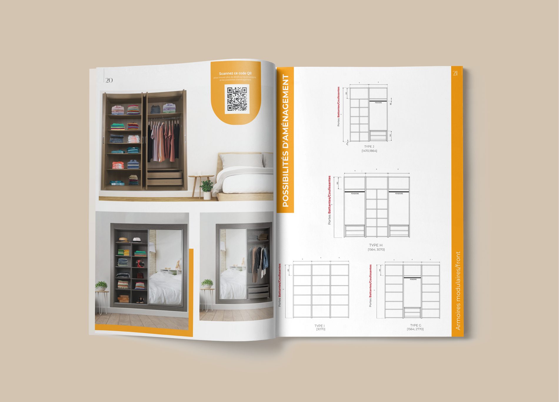
Before handing anything over we put the identity where it was going to live: the storefront sign, the business card, the roll-up at the door, the printed brochure. That is where a mark either holds or falls apart.




Outcome
A shop that looks its age, on purpose
After rollout Arlux reported a clear rise in recognition and good feedback from customers on the new identity.
Key learnings
–
Working inside an agency taught me to manage a client's expectations as deliberately as the design itself.
–
Looking back, I would have spent more time on where the category was heading, not only on where the brand came from.