2023
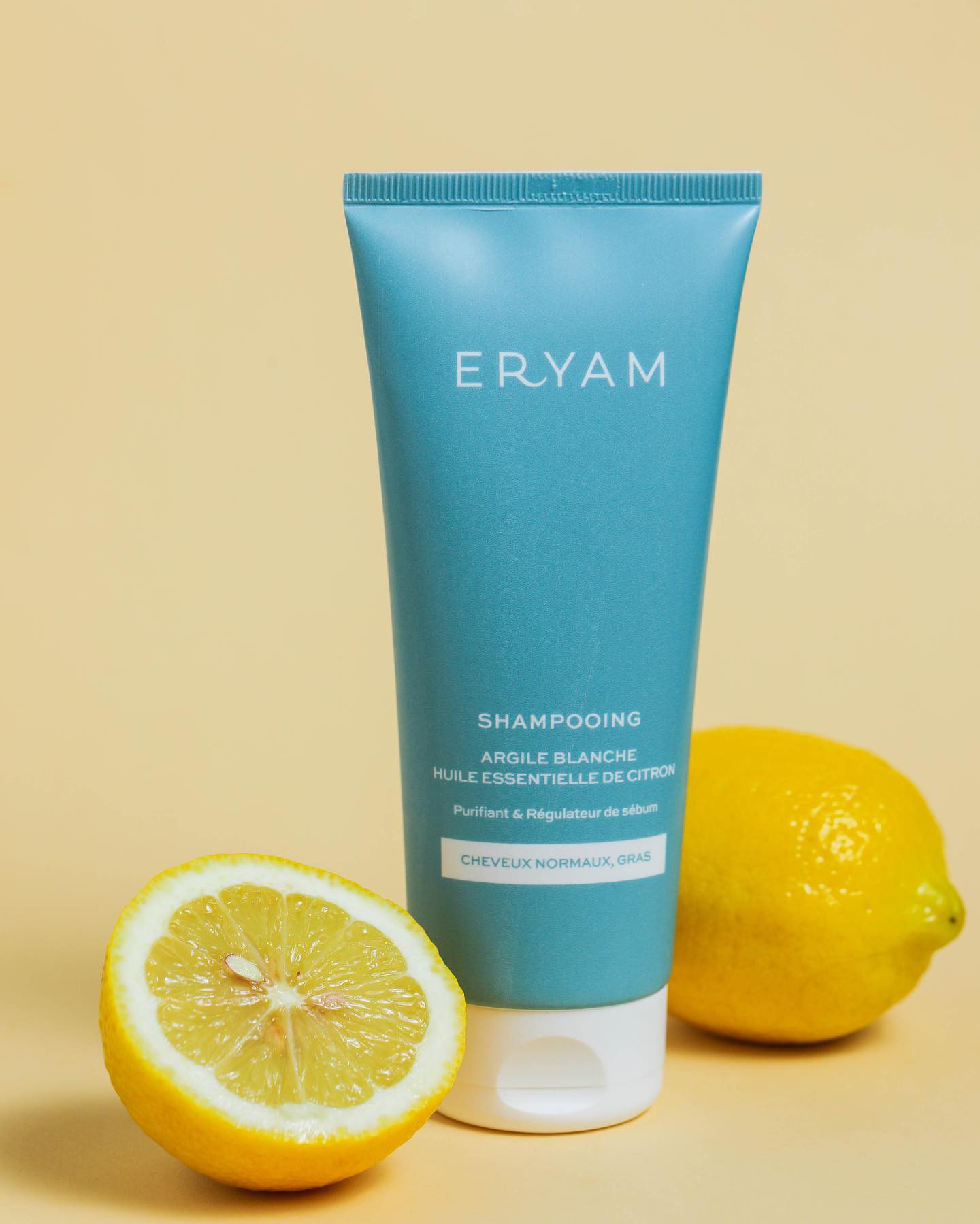
Eryam CosmeticsPackaging for a range of three natural shampoos
Eryam is an Algerian cosmetics brand built on natural formulas — at least 90% natural ingredients, no sulphates, an environmental promise it actually keeps.
Its founder asked me to design the packaging for three shampoos in a new range: the front that sells them, and the back that has to carry the law.
Team
Packaging designer (me)
Founder
Printer
Packaging design
2023
The brief
Say what it is, and prove what it is not
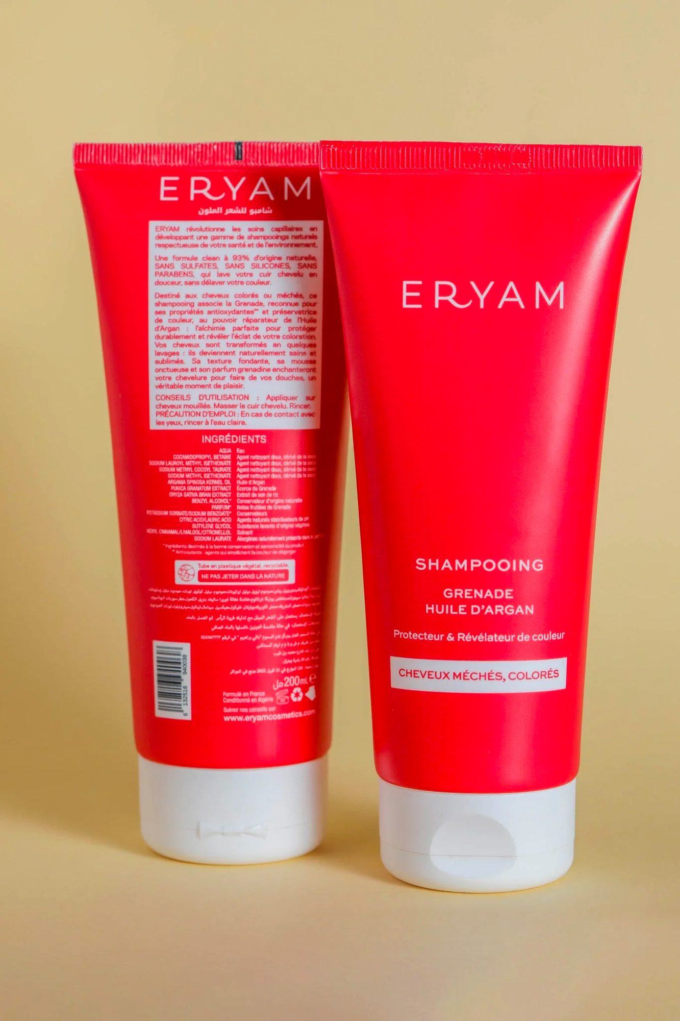
Each pack had to name the shampoo and its base, carry the commercial copy, the ingredients and the legal text, and still look like the simplicity the brand promises.
In cosmetics those two demands pull against each other. The back of a pack is a legal document; the front has three seconds.
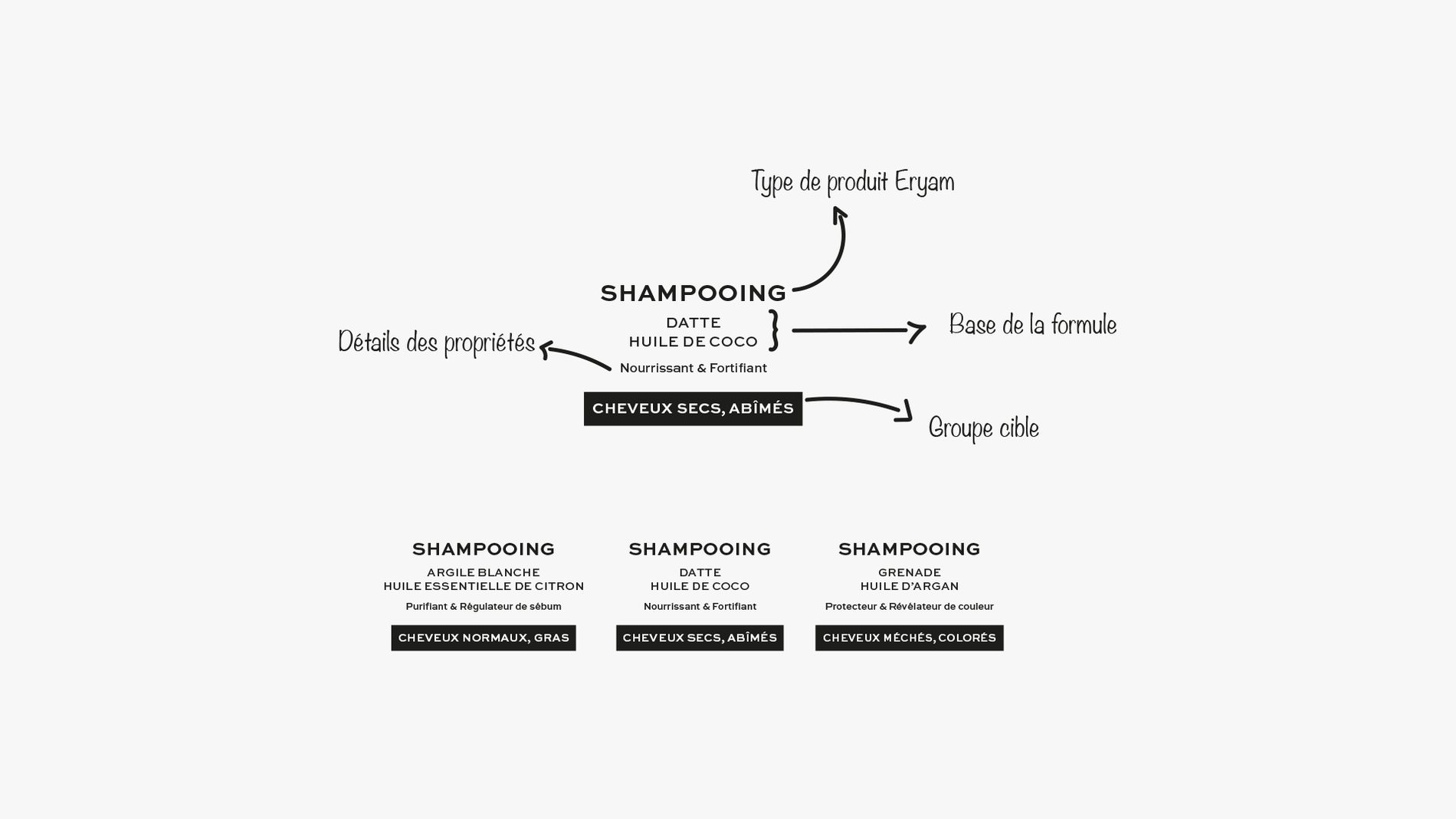
What each face of the pack has to carry.
Research
The shelf was already shouting
I went round the cosmetics retailers and looked at what was on sale. Almost every pack was covered: claims, motifs, colour on colour. Standing out by adding more was not available.
So the mood board went the other way — one colour per shampoo, air around the name, and nothing on the front that does not earn its place.

Design decisions
Two languages, at eight millimetres
The type had to stay readable in French and in Arabic at the size a tube allows, so I chose faces that hold at small sizes in both scripts and set the ingredient list to a rhythm rather than a block.
Each shampoo got its own Pantone, so the range reads as a family from across the shop and as three products in the hand.
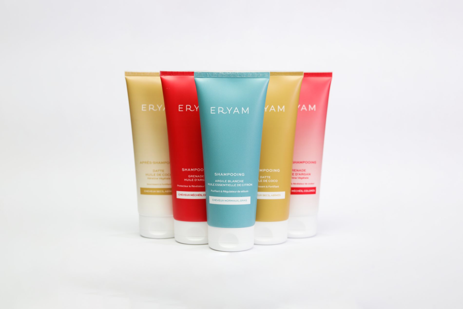
One colour per shampoo, one family on the shelf.
Production
Made to survive the printer
Text was vectorised, margins, bleed and trim followed the supplier's own template, and the file went out in CMYK on the FOGRA 39 profile at 300 dpi.
When the proof came back I checked it against the file — colour, registration, the small text — before the run was cleared.
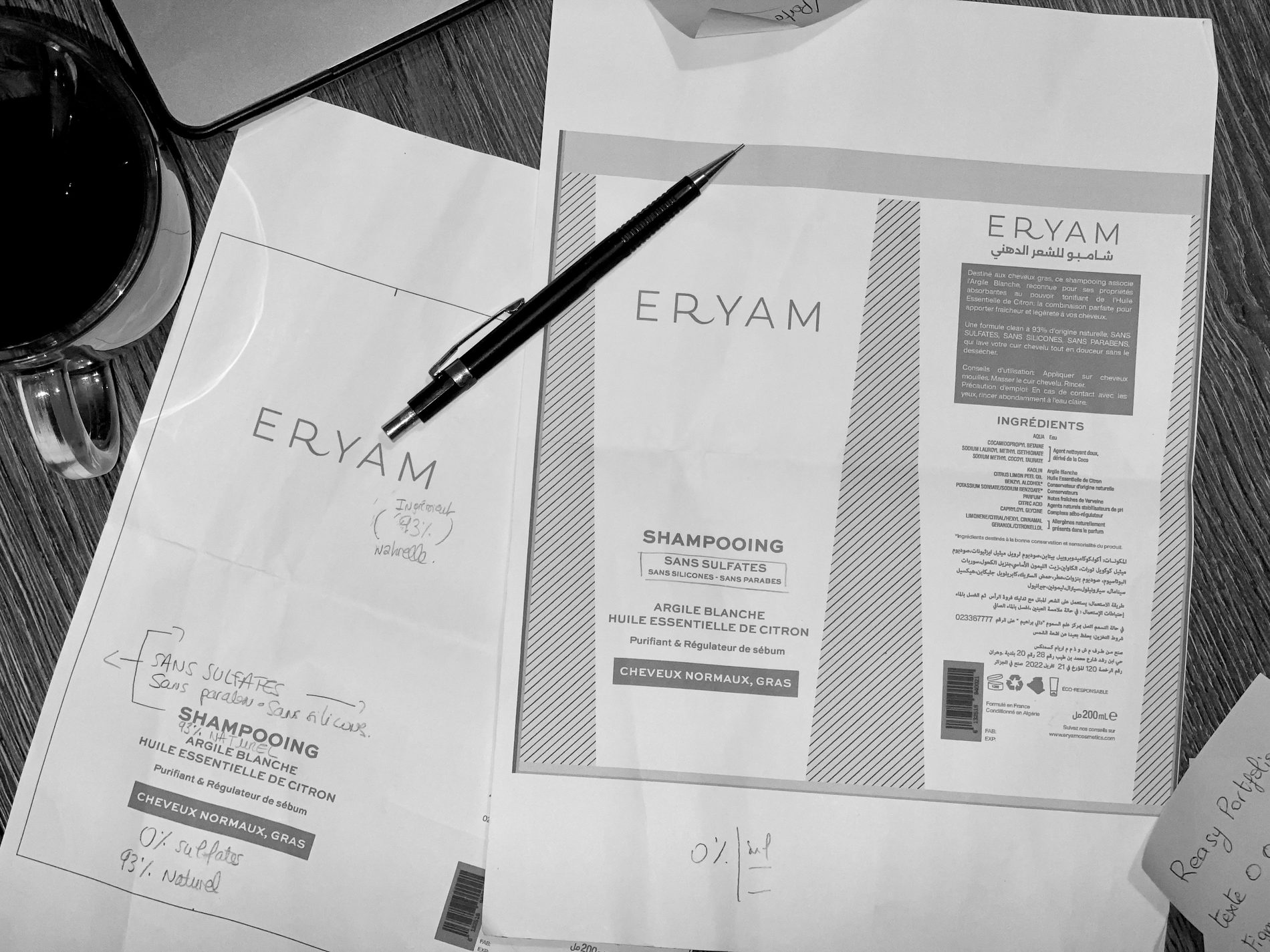
The proof, checked line by line.
Outcome
The range sold, and the packs came back in photos
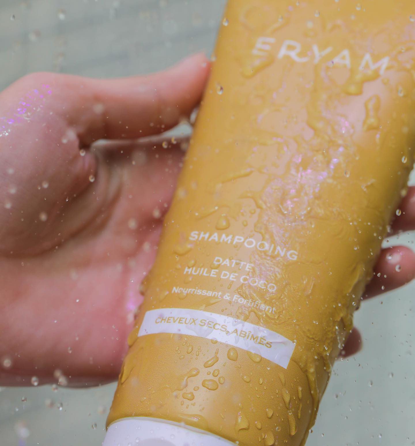
The launch went well: strong sales for a new range and, more telling, customers photographing the packs in their own bathrooms.
Key learnings
–
I used to think cosmetic packaging was easy because the good ones look simple. Getting to simple, with everything the law and the brand demand still on the pack, is the hard part.
–
Print leaves no room for approximation. The decisions that mattered most were the ones about millimetres.